
In early 2015 Northmoor Community Association embarked on the quality assurance PQASSO level 1. This meant that the organisation was literally turned upside and every aspect of what we do and who we are was scrutinised including our website and logo.
There was clear recognition that our logo did not mean much to our service users, the community, volunteers, stakeholders and staff. It did not reflect our purpose, vision, aims or objectives.
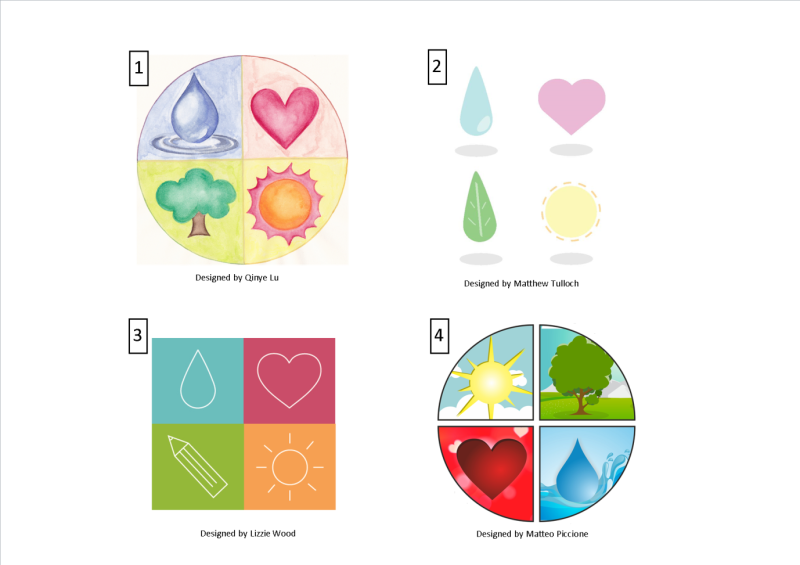
Four volunteers using their creative skills designed different logos taking into consideration our vision and purpose careful to ensure that the many services, projects and themes were reflected within the new logo.
The final 4 designs were then voted on by the community, service users, stakeholders, staff and volunteers with the most voted design being developed into what we have today.
This journey of development involved and gave a voice to the community and volunteers from the outset with their chosen logo which now has so much more meaning and reflects our mission.
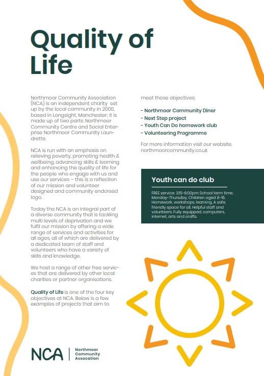
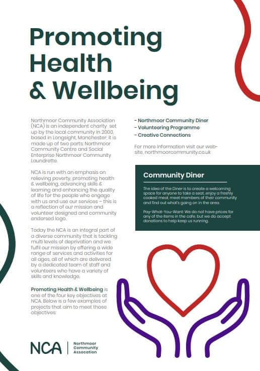
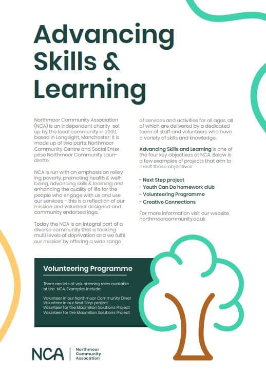
Our Logo centres around 4 key objectives of NCA.
Below are the 4 objectives embedded within our logo and our projects that aim to meet them.
During lock down Tile Creative had some spare capacity and wanted to help the community. One of our previous Trustees Jordan made a link with them and we quickly accepted their offer to re brand. Tile Creative set to work finding out about us and our current aesthetic then put together two brand options. After much debate from our staff and board of trustees we chose the sleek logo in the green that reflects to beautiful listed building we are in. We’ve had quite the journey with our logo over the last few years – Tile Creative knows our previous logo is dear to our hearts because it was created and chosen by the community, so they developed it into our “Four Pillars” which represent our aims as a charity.